Summary: Latitude vs. Humidity
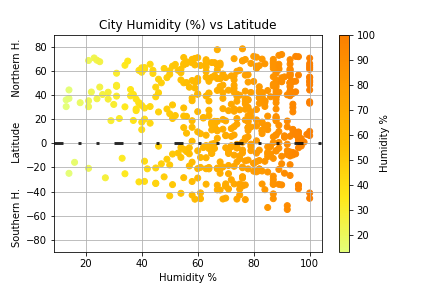
Nope, no correlation here
Since there is no correlation here, let's talk about the charts themselves
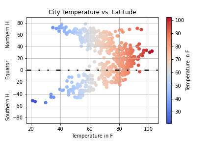
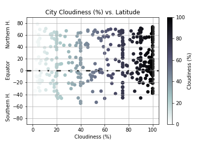
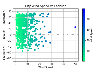
In the sample charts provided, latitude was the x-axis variable. This runs counter-intuitive to our thinking spatially regarding maps of the world. If we were to look at a map of the world or at a globed, chances are we see the equator perpendicular to the y-axis. Therefore, I flipped the axes so that we can view the results in a similar format.
Also, in each of the four charts, I enhanced the way the data is portrayed by using colormaps. In MatPlotL ib, one of my favorite ways to bring a little more color commentary (no pun intended) to a chart is to use colormaps. There are a wide variety of colormaps avialable. Each colormap I chose was relaetd to the data at hand.
- For the temperature scatterplot, I chose the colormap "coolwarm". This allows colder temperatures in blue along with warmer temperatures in red.
- For the humidity scatterplot, I chose the colormap "Wistia". This colormap is yellow to orange which are colors often associate with warmth. While humidity is not the primary factor of warmth, it certainly os s a contributor as anyone living in Austin in June can attest.
- For the cloudiness scatterplot, I chose the colormap "bone", in reverse. This colormap allows us to have a gradient which gives us almost translucent data points for little cloud cover to opaque black data points for total cloud coverage.
- For the wind speed scatterplot, I chose the colormap "winter". Winter typically has bone-jarring winds with strong cold fronts from either Polar or Arctic vortices.
Visualizations